Driving through Roxy Hill and Windy River I (R Creative Advisory Partner, Anne-Marie) winded my way down south.
The early spring leaves were emerging, elegantly presenting a vast range of yellows and greens. A large wisteria tree heavy with lavender, mauve, and violet flowers was waving its treasures in the breeze. As I turned the bend, a long row of cherry and dogwood trees welcomed me with a vast array of pinks and corals and cream blossoms above me.
Oh I wished if only I could blink my eyes like the shutters of a camera and capture all that I saw!
Perceiving and Creating Color
From leaves and flowers to websites and logos, color imparts its beauty and emotion.
Color – It’s About Light
The eye has the ability to take in an incredibly large spectrum in a blink. It can distinguish ranges, tints, densities, and tones so quickly we do not give it a thought.
The eye is a fascinating organ of the human body with an anatomy that works with the nervous system and brain. Its speed in taking in information and processing it is rapid and outstanding. Understandably then, vision is the one sense out of all the five senses which people treasure the most.
Creating Color for Digital and Print Material
How do we take all the colors that we see and put it on a screen or on paper or clothing?
The truth is we cannot perfectly replicate the natural spectrum of light and color, nor what the eye and brain does in microseconds. We do however have several tools of color that work within the environments of print and screens to bring some amazing photos and images to life in 2-D platforms.
Just remember, all color models can only display a limited gamut (range) of colors and light compared to the natural visible spectrum in our world.
Making the Connection from Art to the Eye
HEX, CMYK, RGB, and PMS are a few of the most common color models or matching systems that help connect what our eyes see with the colors we want to present in our materials.
Basically, they are sets of numbers used to express the combination of color or light. Which model you use depends on where you plan to view or apply your color.
Here is some basic information for each model to guide you into which system to employ and how to communicate based on the environment or material in which you are working:
RGB – for screens using light
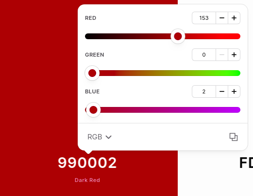
RGB (red, green, blue) is a method of creating coloration by mixing different intensities of red, green, and blue to get your desired color.
Remember when you were a child and had only 3 cups of acrylic paint, one of red, one of blue, and one of green? You mixed differing amounts of each paint together to create all the colors you wanted for your masterpiece.
RGB works similarly. Instead of mixing paint however, we are mixing light.
RGB numbers are based upon monitor settings which emit red, green, and blue light. Through these numbers you’re telling your monitor how much of that particular light color you want to shine.
Your computer monitor, iPhone, television, and other device screens all output using those same colors, in varying amounts. Each color of the RGB model is represented by numbers between 0 and 225 for each red, green, and blue value. This tells a screen how much output of each color to use. Zero is the lowest amount of a color used, and 255 is the highest. If you add no color in RGB (0,0,0) you get black. Using the maximum levels of each (255,255,255) will give you white.
HEX – for websites and coding
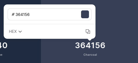
HEX, or hexadecimal numbers, is a human-friendly way to communicate color to computers. There is no informational difference between RGB and HEX colors; they are simply different ways of communicating the same thing – a red, green, and blue color value.
HEX, along with its sister RGB, is one of the color languages used in coding, such as CSS. HEX is a numeric character based reference of RGB numbers.
Whereas we typically count in units of 10, the hexadecimal system is in units of 16: 0-9, A-F. Each of the three RGB numbers is converted using mathematical equations from a 3 digit number to a 2 digit alphanumeric combination. (For instance a value of 255 red would be #FF).
If you are not coding or a web developer/designer, you probably have little need to fully understand the formula of the HEX color model. If you have certain standard colors for your company then you will simply want to keep the HEX values available to share with your web specialists in case you are asked for your color code for your logo, themes, fonts, etc.
CMYK – for printing using ink
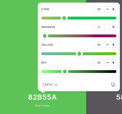
CMYK stands for Cyan, Magenta, Yellow, and Black (K).
When using ink, like in your home or office printer, the color is produced by these 4 base colors.
One benefit to printing in CMYK is the pure black which gives a clean, crisp image, especially important in the text of print material.
CMYK is considered a subtractive form of color creation, meaning a reading of 0% of each color will give you white whereas 100% will produce a rich black. Subtractive means that when all ink is used you have black and as you subtract ink you get closer to white. Each color – cyan, magenta, yellow, and black is measured in a value range from 0% to 100%.
Black is 0,0,0,100.
Sunny yellow is 0,0,100,0.
Printers print with CMYK ink, therefore, regardless of which color model or color space your digital file is, it will be converted to CMYK in order to be printed.
One drawback to CMYK is that it has a narrower gamut of color than RGB, which means that not all RGB colors can be reproduced in CMYK, most noticeably with very bright, vibrant colors.
Neon colors you see on a computer screen are not well reproduced when printing with CMYK ink on paper, because while digital media emits light, ink on paper does not.
The benefit to knowing the CMYK value of your company brand colors is to give this information to a printer to match.
PMS or Pantone Matching System – for standardized color matching
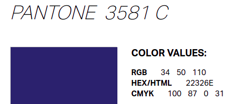
The Pantone Matching System (PMS) is used by printers and designers alike to assure standardized colors across the board.
By using the Pantone color deck, a designer is ensured that the printer will produce the exact right color.
Whether you are having letterhead printed by Mike’s Print House or getting your logo on a T-shirt from Say It With Shirts, if you give your PMS # to the printer your logo on both items should match.
With the PMS deck of over 1,000 colors, different manufacturers can all refer to the Pantone system to make sure colors match without the need for physical samples. It is important to know the PMS color values to communicate and have uniformity with your products.
The Pantone website has a handy tool for finding PMS colors.
Colors are a Combination of Science, Math, and Wonder
Color is a wonder we attempt to express through math and science. Finding ways to communicate what our eyes see is the foundation of the color management systems.
Each device, screen, offset press, and digital printer varies in its reading and output of color. Communicating correctly in each environment is important to produce the closest matches possible for all your web, print, and screen images. This is the most important reason to understand RGB, HEX, CMYK, and PMS.
Communicating Your Brand Through Color
We recommend that you get all of your number values for your images and keep them handy for easy reference. Having these color model values on hand will be helpful for you, will improve communication with your suppliers of print and web, and also ensure consistency and quality for all of your materials.
By understanding the color management system and keeping your brand’s color values available you will ensure that your logo, images, and colors are consistent from the Web and downloadable tools to brochures and t-shirts.
Let’s Have a Little Color Fun!
Now let’s take a step back to the first paragraph of this article and pick one of the many colors I named – let’s go with the emerging violet buds that I saw in the flowering wisteria.
How would we express the values of violet in each of the platforms mentioned?
In 2018 Pantone’s “Color of the Year” was 18-3838 or 2096 C Ultra Violet, a blue-based purple! The deep purple is intensely beautiful and evokes a feeling of royalty and creativity.
Okay, so I just gave that away… PMS 18-3838 or 2096 C is the value for violet in the PMS model.
Here are the equivalents of Ultra Violet in the other platforms we spoke of:
- RGB: 101 R, 78 G, 163 B
- CMYK: 76 C, 75 M, 0 Y, 0 K
- HEX: 654EA3
Now you try it with your favorite color! The good people over at RapidTables have developed color value converters you can try here.
Another Fun Take Away
Watch for the “Pantone Color of the Year”, announced every year in December for the following new year. Here’s 2021’s winner!
Be intentional in using that color to catch the attention of customers. Remember that color awakens feelings so use appropriately to express and support your message. Have fun! Consider these past winners in any “retro” or “vintage” projects! Remember to note the equivalents of your color choices in RGB, CMYK, and HEX for quick reference and use them correctly in suitable platforms.
R Creative’s graphic artists can help you hone your brand’s colors
Whether you need a total company re-brand or just need to tweak your brand colors for your new website – R Creative is here to help.
